Select country
Domicem: new graphic layout, usual high quality
The new logo was presented during the year-end convention, along with the company results and future strategies.
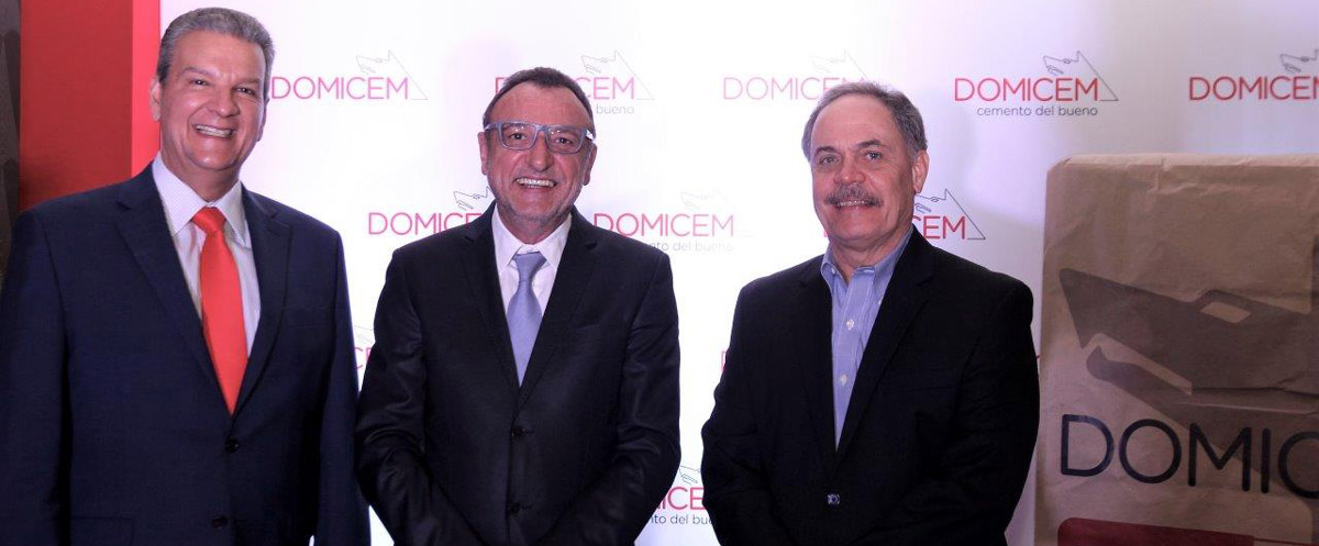
The year-end company convention held on December 8th was not just a traditional event for exchanging Christmas greetings, as it used to be in the past. On that occasion, in fact, Domicem presented the new graphic layout, which will characterize the company in the next few years, to its employees, customers and stakeholders attending the convention.
The new Domicem logo has been renovated without altering its identity, always keeping its focus on elegance but with a more contemporary style and ‘softened’ lines. Continuity with the past is the key feature of Domicem , which stands out in the reference market thanks to its clear distinctive values. A company which is modern, dynamic, environmentally - friendly and attentive to the people , implementing a sustainable industrial approach where high quality cement (“Cemento del bueno”) is combined with process innovation.
The Chairman, Mr. Marco Focardi, pointed out how the excellent results achieved in 10 years of operation, represent another incentive for Domicem to further strengthen its position in the Caribbean market. Its expansion strategy is based on continuous revamping activities carried out in its production sites, along with efficiency processes aimed at energy saving and emissions prevention, thus always ensuring high quality products and services.
The new graphics will also characterize the packaging, thanks to new bags that will be ready very soon; in addition, the new web site will be available in January 2017.


